
| Coverage Simulations for Band 2 Candidate Array (fpa143 at reduced bias) | |
We present simulated depth-of-coverage maps using bad-pixel masks constructed from a WISE band-2 (4.7μm) candidate array. This is referred to as detector "FPA143_lowbias" in the test suite.
The simulations below are an extension of those for the same band-2 candidate (Coverage sims for fpa143), but with the array set at a reduced bias. The bias voltage was lowered from 250mV to 175mV. The purpose was to try and improve the bad-pixel performance by lowering the well depth (effectively from ~115,000e- to ~90,000e-). The main outcome is that the number of pixels that saturate in the A/D goes down from 0.3% to 0.02%.
Below we adopt the same assumptions, methodology and software as presented in previous simulation runs, e.g., Coverage sims for fpa141.
The main input is a bad pixel mask image provided by the WISE Science Project Office. This was recieved as a 1024x1024 FITS image with bad pixels denoted with a value "1", and good pixels denoted with value "0".
For "FPA143_lowbias", bad pixels were identified using the same criteria as outlined in Coverage sims for fpa 141. For your informaion, ~2.9% of pixels in FPA143_lowbias (in the active region) are now declared as bad, compared to ~5.2% for the same array set at a higher bias voltage (see Coverage sims for fpa143).
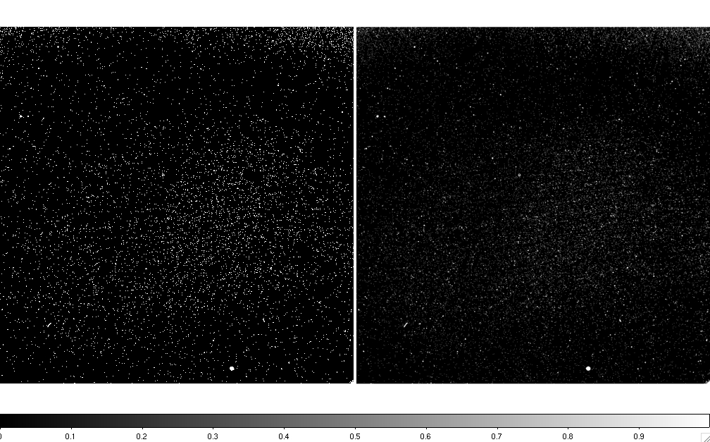 |
| Figure 1 - Left: bad-pixel mask from FPA143_lowbias provided by project office. Right: same mask after smoothing with an interpolation kernel (see below for details). Click on image to enlarge. |
These masks can be downloaded in FITS format here:
We performed two simulations, each consisting of 100 (15-orbit) coverage realizations, corresponding to two bad-pixel masks: one using the default mask, and another using the same mask but smoothed with an interpolation kernel.
We present below coverage fractions, maps and histograms computed from the 100 realizations. These statistics represent the fraction of pixels (or area) within a simulated 2048x1024 central region with that depth-of-coverage. The means are computed over all realizations. The coverage maps represent those whose coverage fractions fall closest to the mean fractions.
cov.  mean fraction (0 degrees)
4   0.00015978
5   0.00296004
6   0.03090069
7   0.15868088
8   0.29023703
9   0.27494447
10  0.15812363
11  0.06120418
12  0.01750559
13  0.00339246
14  0.00076413
15  0.00022826
16  0.00079893
17  0.00009986
cov.  mean fraction (90 degrees)
4   0.00017680
5   0.00314759
6   0.03228805
7   0.16117956
8   0.28939181
9   0.27327625
10  0.15739666
11  0.06147846
12  0.01688073
13  0.00328725
14  0.00069765
15  0.00029967
16  0.00039956
17  0.00009989
 |
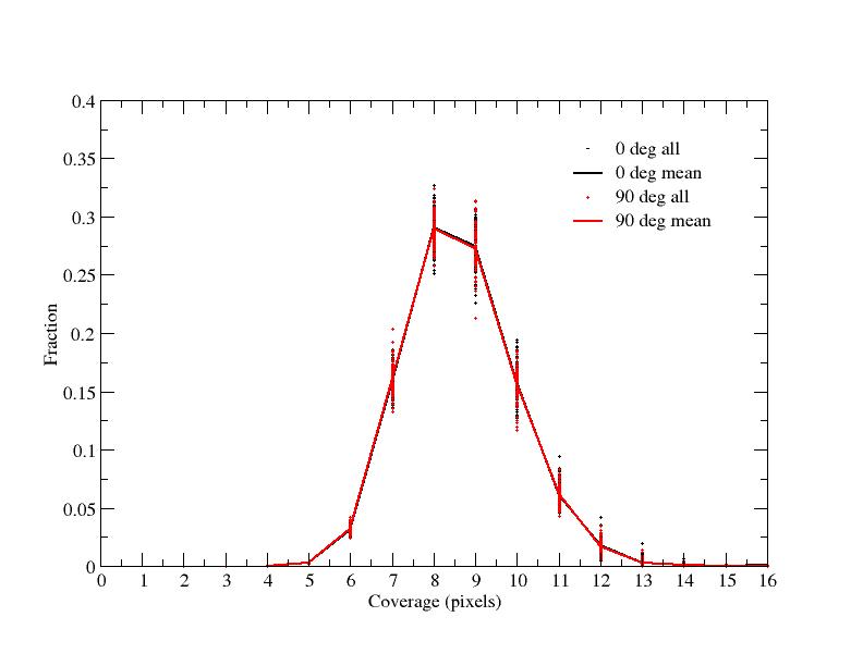 |
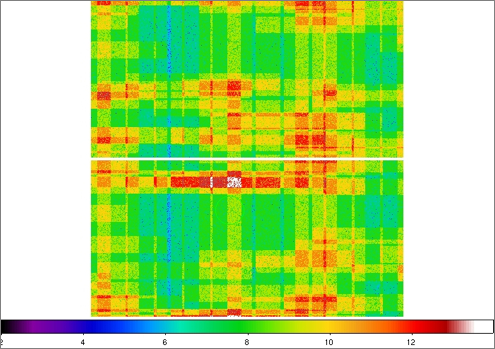
| Figure 2 - Coverage maps for Test 1 (default mask): top = 0 degrees; bottom = 90 degrees. | Figure 3 - Coverage distributions for Test 1 (default mask). |
| Left: false color JPEG images of coverage maps for the default mask. The color bar at the bottom corresponds to the approximate coverage depth. Right: corresponding coverage distribution with fractions normalized to unity. Dots represent the 100 individual realizations. The lines go through the mean fractions from all realizations. Click on thumbnails to see full-size JPEG maps. | |
Summary
cov.  mean fraction (0 degrees)
5   0.00031282
6   0.01524354
7   0.14330952
8   0.29332132
9   0.29246380
10  0.16833764
11  0.06520483
12  0.01742533
13  0.00331735
14  0.00073898
15  0.00027484
16  0.00004997
cov.  mean fraction (90 degrees)
5   0.00033576
6   0.01560488
7   0.14146726
8   0.29271856
9   0.29064004
10  0.17138096
11  0.06486780
12  0.01805614
13  0.00365839
14  0.00088919
15  0.00028104
16  0.00009992
 |
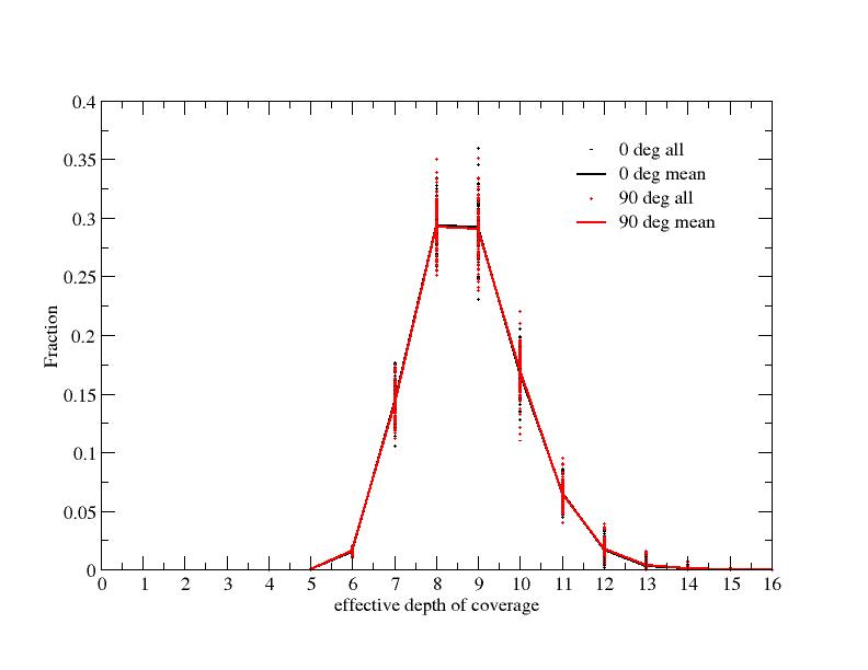 |
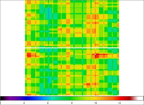
| Figure 4 - Coverage maps for Test 2: top = 0 degrees; bottom = 90 degrees. | Figure 5 - Coverage distributions for Test 2. |
| Left: false color JPEG images of coverage maps for Test 2 (including smoothing from an interpolation kernel). The color bar at the bottom corresponds to the approximate coverage depth. Right: corresponding coverage distribution with fractions normalized to unity. Dots represent the 100 individual realizations. The lines go through the mean fractions from all realizations. Click on thumbnails to see full-size JPEG maps. | |
Summary